A recent article in The Atlantic looked at the infant mortality rate in the United States and why it appears so high in comparison to the rest of the world.
After all, the Untied States is one of the richest countries in the world with some of the most sophisticated medical care in the history of mankind. It seems a bit odd that the infant mortality rate is about 6.1 for every one thousand live births. That puts the Americans somewhere on par with the Poles and the Slovaks, incidentally.
As The Atlantic piece notes, a recent paper at the University of Chicago explains the numbers. About 40% of the difference between European and American infant mortality numbers comes from a difference in reporting babies born before the 24th week of gestation. In other words, Americans report births for premature deliveries that aren’t reported elsewhere.
The biggest difference, though, came from babies after the first 28 days of life. In particular, the paper shows that infant mortality for white children is comparable to European data. Infant mortality among non-white children, from predominantly lower socio-economic circumstances, is much higher and therefore the overall American infant mortality rate is higher than in Europe.
So what about Newfoundland and Labrador?
Well, the infant mortality rate (infant deaths at one year) is about 6.3 deaths for every thousand live births. That’s right on par with the American numbers overall and globally puts us right there with the Poles and the Slovaks.
In the table, we can see the provincial and national infant mortality rates for the past 20 years. The information is from Statistics Canada. While the current rate is lower than it was 20 years ago, you will notice that except for a period between about 1999 to 2004, the infant mortality rate in Newfoundland and Labrador has been higher than the Canadian average.
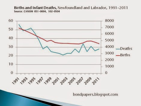
There doesn’t appear to be any research into the causes for the higher infant mortality rate in Newfoundland and Labrador compared to Canada. Just to help put the local rate s into perspective, the table below shows the number of births (right vertical axis) and the number of deaths (left vertical axis) of infants less than one year old. You can see there was a dramatic – and entirely unexplained – drop in the number of infant deaths between about 1994 and 1997.There’s a small decline in the number of deaths until 2002 when the numbers start to increase slowly.
-srbp-

