11 October 2006

So it's okay to be an anti-Semite, Ward?

Or maybe you just share the anti-homosexual views of Darrel Reid and James Dobson.

Anyway.

Some time ago, Bond Papers established a policy of not directing free traffic to some websites. Frankly, some of them didn't deserve the attention they were getting.

But a post on Venison Tickle, a blog that purports to offer "outside the box thinking" is worth exposing to a national audience.

Seems the author - Ward Pike - has a problem with Rick Mercer's latest rant that, among other things, draws attention to some questionable comments by Rona Ambrose's newbie chief of staff and some of his associates on both Jews and homosexuals. The shorter video version is at cbc.ca.

Pike suggests, among other things, that Mercer's rant is part of the Liberal bias in Canadian media. As Pike puts it:
You see so many anti-Conservative party of Canada rants, it makes you want to "de-tune" or "tune out" man. This constant desensitizing to the Liberal plot to vilify and sensationalize any Conservative value with comments like "are you or have you ever been near a homosexual" no longer serve to marginalize the CPC but instead serve to show the majority of voters how weak and pathetic the Liberals and their cronies, like Rick Mercer, have become.
Having trotted out the old Connie conspiracy theory about media bias, Pike ends up with this gem:
I realize that heavily left-biased programming (er... thinking) fits in well with the vast majority on the CBC payroll (I hesitate to use the word workers, as I have seen people work, worked myself...and I have been to the CBC)...but it doesn't jive with today's actual grip on reality.
Grip on reality? Anti-semitism is real, as in okay?

Conservative values? That includes anti-semitism. I know Conservatives who'd disagree on that one, even though they'd readily admit Conservative values don't include supporting freedom of choice in everything from a woman's control of her body to sexual expression.

At this point, I tried several different ways of summarizing Pike's position and pointing out the obvious factual, logical, historical and ethical problems with it.

But frankly, it's hard to top the sheer inanity of Ward's own words.

Instead, let's just let Pike speak for himself.

That still doesn't explain Harbour Breton

Okay, Danny.

You're right.

It was politically naive to have pledged you wouldn't let the Abitibi mill at Stephenville close.

That still doesn't explain your similar pledge to the people of Harbour Breton.

Or the people of Goose Bay.

For that matter, it doesn't explain your threats to expropriate property.

Since you haven't expropriated the property - in fact you have subsidized Abitibi's other operations instead - it's hard to see how "myself and my government have done everything we can to try and save it, including stepping up significantly in order to save that mill, and I can't do any more than that...".

There's something insincere in Danny's mea culpa.

Abitibi cuts; Danny pays subsidies

Abitibi Consolidated announced on Tuesday that the company was closing lumber mills and laying off 700 workers in order to staunch the bleeding to its bottom line caused by slackening demand, a higher Canadian dollar and rising energy costs.

The cuts, to Abitibi's Quebec lumbering operations, will see four mills close. The American news organization Bloomberg attributes the Abitibi cuts to slowdowns in the American home construction and renovation market.

Last week, natural resources minister Kathy Dunderdale announced the provincial government would subsidize power rates to the major industrial power users on the island portion of the province. Dunderdale described the CDN$10 million subsidy as a payment representing the portion of the Rate Stabilization Plan owed by the now-defunct Abitibi mill at Stephenville.

Curiously, the amount of the annual subsidy is the same as the total amount Danny Williams previously offered to Abitibi in order to keep the Stephenville mill open. Bond Papers previously established that Williams' original subsidy represented up to $3.0 million more than the Stepehenville mill generated in tax revenue for the provincial government.

The current subsidy represents a complete loss to the treasury since the remaining mills have not increased output to replace the production at the Stephenville mill.

The new subsidy effectively reduces power costs to the two remaining paper mills, one at Grand Falls-Windsor and the other at Corner Brook. The province's news release did not clearly indicate the duration of the subsidy.

Kruger's Corner Brook Pulp and Paper employs 1300 people in its harvesting, papermaking and power generation facilities. Abitibi's Grand Falls-Windsor plant employs 490. The government subsidy amounts to $5, 586.60 per employee.

10 October 2006

If I had a million dollars...

of public money to spend, you can rest assured it would not have been wasted on an over-hyped tourism wordmark.

Nope.

Especially when it is being touted as a "brand" and business minister Kevin O'Brien - the guy responsible for selling the thing - can't tell the difference between a brand and a logo. Open Line host Randy Simms raised that point with O'Brien, who proclaimed his own extensive business background, and while O'Brien said he knew the difference, his comments demonstrated he didn't have a clue.

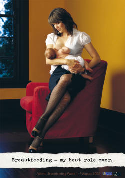
If I had a million bucks of public money, I'd spend it to promote breastfeeding in Newfoundland and Labrador. There is a public shame that groups interested in promoting child health have had to go public on their own to raise this important health issue.

As the CBC news story linked above states:
Doctors agree that breastfeeding is the best way to protect newborns from early childhood disease, because mother's milk contains antibodies that help babies fight infections.
About 63% of new mothers in Newfoundland and Labrador begin breastfeeding, compared to 85% nationally. The real test is how many are still breastfeeding when their babies are six months old.

According to the Breastfeeding Coalition of Newfoundland and Labrador:
In Newfoundland and Labrador, there has been an increase in the initiation of breastfeeding over the past 20 years. In 1983, 31.9% of women initiated breastfeeding (11) with 62.7% of women initiating breastfeeding in 2003. (12) However, 62.7% is the lowest initiation rate among the provinces and territories in Canada. Furthermore, the duration rate at 6 months is 27.5 % at 6 months, with 11.1% exclusively breastfeeding at 6 months. These statistics tell us that we are living in a culture where breastfeeding is not the norm.
Fewer than half the women who start breastfeeding are still nourishing their children that way six months later and only 11% are breastfeeding exclusively.

A simple campaign to promote breastfeeding would hardly cost $1.0 million. But even if it wound up costing the government twice that amount, the long-term health benefits to the people of the province would vastly outweigh the expenditure. (Left - poster from a breastfeeding campaign featuring television celebrity Lucy Lawless)

Curious refinery logic

CBC radio snagged Brian Dalton, spokesperson for the group studying the possibility of building a second refinery in Placentia Bay.

He was asked to comment on the prospects that the Irving's announcement of a second refinery at Saint John hurt the potential Dalton's team would go ahead with their project.
[Dalton] said Saint John and Placentia Bay - the site of North Atlantic Refining's operation in Come By Chance and the prospective site for its plans - are the top two ports on the continent for refining traffic.

"You can look in Europe, you can look all along the Eastern Seaboard of North America...these two sites just stand out," Dalton told CBC News.
That's another one of those "Huh?" moments. The ones where you look at the words and develop that face like a dog hearing a noise he can't quite figure out.

The site isn't the driver. It's the cost and the potential to return the money invested.

Dalton didn't speak to that point, nor did he speak to the fact that event Irving's are trying to find funding partners.

Like Dalton's group, which has practically no experience in refinery construction and operations.
But plenty of experience bankrolling projects.

Hmmm.

At Bond Papers, we'll stick to our contention that Irving put a major dent in prospects for a second refinery in this province when they announced a second refinery for the New Brunswick port city.

We'll even add to that.

The chances are much higher now that the overseas investors Dalton and Altius Minerals has lined up will be looking hard at going into business with the Irving's in New Brunswick rather than sinking their billions into a greenfield project in Newfoundland and Labrador.

For some, it's youtube.com.

For others, it's despair.com

Like towniebastard.

09 October 2006

Victoria tourism spot-on

When you've finished being suitably appalled at the throw-back tourism piece from Dallas, consider the superlative - and seasonal - writeup on Victoria, British Columbia.

Victoria is a marvelous city. Even if I hadn't been there already, I'd want to go there - in October - and visit this supposedly spooky place.

The St. John's of writer Mcclaine is creepy but for all the wrong reasons.

Tourism SNAFU

A story in Sunday's Dallas-Fort Worth Star-Telegram seems filled with every cliche about Newfoundland you can find.

If this piece fits with any of the current marketing messages we ought to be using, then maybe we need to do more than think of a cute logo. Maybe some marketers need to be shot and their heads mounted on poles, pour encourager les autres. For crying out loud, a chunk in the middle is nothing more than a recitation of jokes using The Other N-Word.

Someone might want to take the guys aside at this golf course and set them straight on how to deal with customers:
I had been warned to "pack an umbrella and maybe some snow boots" by the folks who operate the semi-private, 36-hole Clovelly Golf Course, even though I was going to be visiting in late summer.
If the N-word stuff wasn't bad enough, there's talk of the local minstrel shows, otherwise known as "Screech-ins", in which locals adopt the very best Stepin Fetchit attitudes:
To be screeched in is to be officially welcomed as an honorary Newfoundlander. It's an age-old ritual involving rum, a ridiculously nonsensical incantation ("Is ya a Screecher?"; "Indeed I is me ol'cock!"), a chunk of bologna ("Newfie steak") and the kissing of a fish, but as we had no cod, I had to kiss a puffin. A carved one, but about as hygienic as the Blarney Stone on a busy day.
The only thing harder to imagine than this thing being written today as opposed to 40 years ago?

That a single traveler in Dallas-Fort Worth will bother to head to a place farther away from DFW than Honolulu.

Notice that fact gets mentioned.

The city Buzz Mcclaine wrote about is not a place to visit; it is a place to read about and avoid.

Logo loogies

Some logo-related quickies for a holiday Monday:

1. Ontario is in the grip of a controversy for the new version of the trillium being proposed by the McGuinty government. The original trillium design as the visual identification for the government has been around since 1964. (right)


The new version (left) has been called three men in a hottub.

2. So too in Manitoba has there been controversy over logos and wordmarks. in this case the province created a new workmark "Spirited Energy" to replace "Friendly Manitoba".

The new wordmark could suggest that Manitoba's drive is derived from an attachment to a belief in ethereal beings - i.e. they have a hard time dealing with reality - or from a drive to the local liquor store, again suggesting a difficulty with reality.

The old one just suggested a place that was very generous with its affections.

Manitoba needs to go back to the drawing board.

3. Surprisingly, not every Newfoundland and Labrador logo has been replaced, even the sites run by the provincial government.

- As of Thanksgiving Monday, the government's business development site, nlbusiness.ca, is devoid of the new business-attracting logo. This situation still exists even though the provincial government's own website - gov.nl.ca changed on the day of the announcement. Government's job ads had a new format this past weekend as well.

- Ditto for the tourism site, even though the new Danny-mark is supposed to lure more tourists here, what with its innate "quirkiness" and all. Nope, newfoundlandandlabradortourism.com is still using one of the many other old logos (left) instead of the new Danny-logo.

Maybe they didn't get the memo.

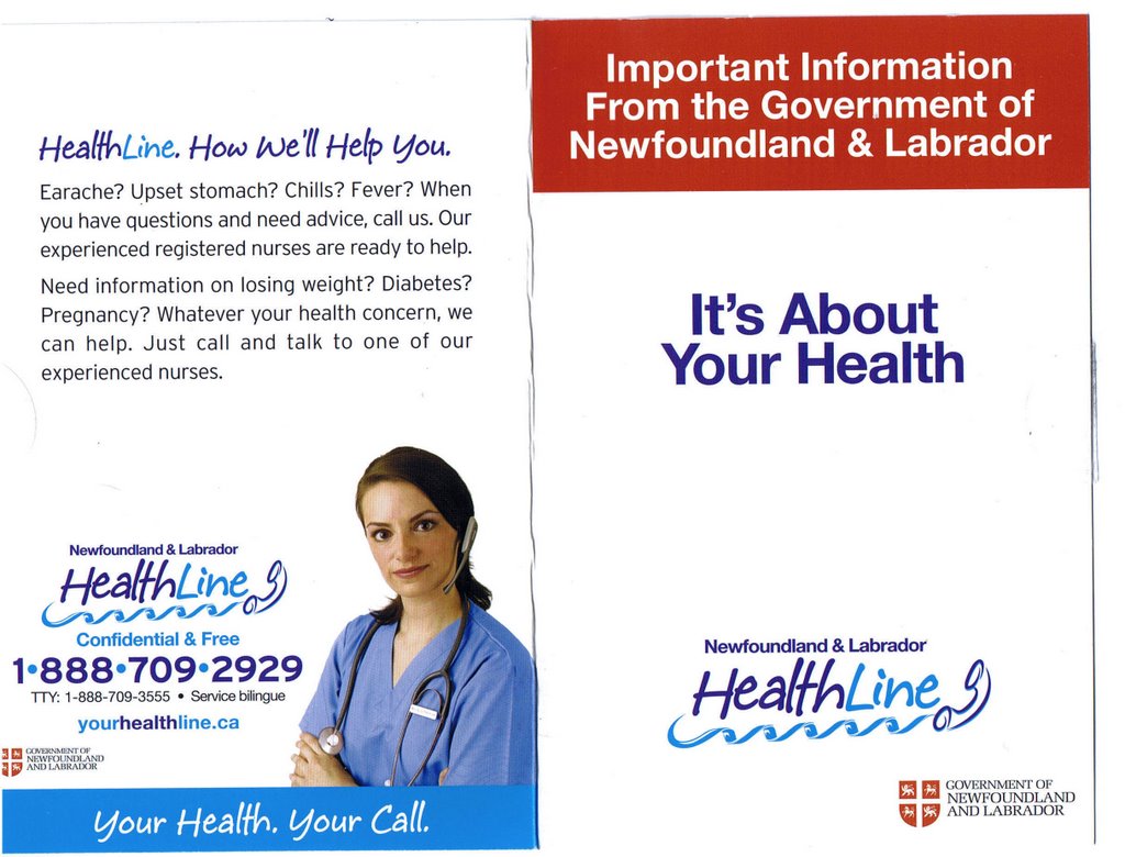
- Same could be said of the crowd responsible for the health help line. Friday's mail brought a little information package including some telephone stickers and a cheap fridge magnet. (right) Will these have to be re-printed and at what cost?


And a gajillion instances of the old government logo (left). For the purposes of illustration, we have taken the logo and adjusted it slightly to take out the words "Government of". The main part of this logo is the shield from the province's coat of arms, granted in 1638.

Compare this one to the Little Logo of Horrors version currently sanctioned from on high.

08 October 2006

Our plastic identity

On the heels of the tourism bed sheet fiasco comes the new provincial tourism logo, being grossly oversold by Danny Williams as the answer to all our prayers.

Apparently, it is not merely a tourism logo but the one symbol by which one people will be known with one voice coming from one leader. (Check out the full page print ads running this week. Shades of Ein volk, Ein Reich... but I digress.)

Anyway, an astute Bond Papers reader discovered an odd similarity between Danny's Logo and the Irish tourism logo. The Irish one features the word "Ireland" surmounted by a lovely green shamrock.

Now the shamrock is an established Irish icon, much like the Irish harp featured as part of the official government visual identity. The pitcher plant is by no means as clearly identified with Newfoundland and Labrador as is the shamrock with Ireland. Nevertheless, Newfoundland is surmounted by a local three-headed substitute.

Take it a step further and you'll notice that there are - inexplicably - three beach ball/pods on the Newfoundland and Labrador word mark, although the pitcher plant does not, as a rule, grow more than one stem and flower. There's no obvious reason for there to be three beach balls if the new Newfoundland and Labrador tourism logo is supposed to represent the pitcher plant. But three are there.

So what does it represent? Put the question to the government publicity machine and they will spit back and answer: whatever they want it to mean. Biblical allusions might be accepted.

At the same time as you are pondering the curious number of rip-offs similarities between stuff Danny has been pumping out and other people's work, think about the way Danny Williams has oversold his own little logo as being the embodiment of everything under the sun to replace the 40-odd logos already out there.

Do an "audit" in Ireland and you'd likely find as many logos or more. In Ireland, the official government logo/visual ID continues to be the Irish harp. There would seem to be no overwhelming reason to change it just as there was no overwhelming reason to do away with the old provincial government visual ID. It may have needed some tweaking, but fundamentally it worked for its purpose. Now, we have replaced a symbol of authority with a cutesy child's drawing of some alien invaders as the visual symbol of a government.


In the Irish business development agency, there is a specific logo for the initiative itself (left). The government program the agency falls under has another logo (right) which incorporates the harp; that tells you it is a government initiative.

Now it should strike you as odd that Danny Williams has turned around and banished all but his own logo. That is, odd if the so-called Irish tiger has been as successful as it has been with all these logos and word marks, and Newfoundland and Labrador under Danny Williams is supposed to emulate the Irish model and thereby Ireland's success.

Well, the obvious answer is that the Danny-logo has nothing to do with anything he claimed.

We've noted that already.

On another level, this logo business is just another example of how some people treat our history and identity as something they can re-invent for their own personal purposes.

It is our plastic identity.

That phrase Bond Papers tossed out before - the Celtification of Newfoundland and Labrador - didn't just fall from the sky. It came originally from a character very closely associated with Danny Williams. It should come as no surprise that somewhere in Danny Williams' agenda, the stuff he manages to do best - or focus most on - are the things having to do with image and identity.

While its advocates say otherwise, at its heart, the image manipulation displays a fundamental contempt for the province, its people, their history and traditions. The image manipulators treat our own culture - supposedly their own culture - with the same contempt they displayed in the Canadian flag fiasco.

More than anything else though the energy expended on rearranging the symbols of identity is just a demonstration of the fundamental bankruptcy of the position these cynics put forward.

The more effort a government spends on playing with our plastic history or our plastic identity, the less work they are doing laying concrete foundations for our future.

That's the real image the Danny-logo represents.

-30-

Sunday Funny: Kill 'em with Komedy

In politics, some of the most devastating attacks can be done with humour or, as in the example to follow, ridicule.

Head to youtube.com and you can find plenty of excerpts from Triumph des willen [Triumph of the will], Leni Reifenstahl's 1935 propaganda masterpiece. Wagnerian music, goose-steppers galore and some camerawork that creates a truly breathtaking view of the 1934 Nazi Party rally in Nuremberg.

Breathtaking that is, if you don't have any idea what Hitler and his lackeys' were up to at the time and planning to do later.

But the over-the-top posturing of the Nazis easily lent itself to a simple human emotion that pulls the whole thing into perspective: humour.

During the Second World War, British and American propaganda teams tended to rely more on humour to poke at Hitler for popular consumption. Cartoons were especially popular and both Warner Brothers and Disney in the United States produced training films and propaganda films as animated shorts.

One of the numerous examples of their comedy art is in this Universal newsreel from the early 1940s. It takes clips of Hitler and of German soldiers marching and edits them together Doin' the Lambeth Walk, a tune from a popular pre-war West end musical. The result is hilarious over 60 years later. Lambeth Walk was also a London street particularly hard-hit by Nazis aircraft druing the Blitz.

The two minute clip was effective at the time.

Nazi propaganda minister Joseph Goebbels is said to have stormed from the screening room cursing and knocking over furniture when he was shown this.


Of course, sometimes, ridicule isn't part of an orchestrated political attack. Sometimes some over-the-top posturing leads to ridicule that just happens naturally.

Right, Danny?

06 October 2006

Danny's Gang or the Friday Five O'Clock Follies

It's late on the Friday before a holiday weekend.

What better time for the provincial government to release some major announcements. Heck, a complete waste of time - like the new Danny-logo, hailed as the most stupendous event in the province's history, or words to that effect - can get huge amounts of government dollars.

But what warrants government sliding it out late in the week?

Try this stuff:

1. "Stephenville? Where's Stephenville?" said the Premier. The environment minister releases the Abitibi mill closure from environment assessment review. Only a few short years ago, Danny Williams was promising the mill would not close on his watch. It didn't. He meant the watch on his arm and there was never a plant on his watch. It couldn't. The mill it Stephenville is inanimate. There was no way it could close in on Danny's watch as long as he stayed out of the building.

2. Subsidizing industry, without saying it. The announcement - actually on Thursday - that government will be handing $10 million to Newfoundland and Labrador Hydro to pay for electricity that normally would have been used by the above-mentioned Abitibi mill.

The provincial government is effectively subsidizing the electricity rates to Kruger and to Abitibi's Grand Falls operation. He previously rejected an industrial energy subsidy to Fishery Products International.

Presumably, this subsidy will only be paid until the INCO smelter is built at Long Harbour. That is, when the Premier stops trying to hold up the construction.

During talks with Abitibi about the Stephenville mill, Williams committed to pay the company an energy subsidy up to a maximum of $12 million a year if the mill stayed open. That amount was actually larger than the tax revenue government gained from the mill's operation.

Expect that one of the natural resources minister's talking points notes that the $10 million subsidy is actually lower than the previous commitment to Abitibi and is being shared with the mill at Corner Brook run by Kruger.

A large double-double to the reporter who puts that to the minister an doesn't hear back the talking point given here or a close variation.

3. Fewer ferries operated by a private sector, not-for-profit. Transportation minister John Hickey released a long-awaited study into the province's ferry system.

The consultant recommended reducing the size of the fleet from 14 vessels to 12. It also recommended having the system run by a not-for-profit but privately incorporated entity like BC Ferries.

The vessel replacement portion of the plan is estimated at $80 - $90 million spread out over time.

The minister's new release contains very little factual information, incidentally, but it does have tons of partisan rhetoric. That's what you have to resort to when either:

a. You didn't read the study before you wrote the release; and/or,

b. You are politically afraid of the increased ferry rates resulting from the decision.

Expect the departmental talking points, drafted by Krysta Rudofsky's former sidekick, will play up the millions in new work for the Marystown Shipyard.

This way of spinning the message would be a political salve for the considerably more Marystown lost in the Premier's failed Hebron deal. People in Marystown will recall that they could have been doing Hebron and the ferries.

4. "You'd make more with FPI's wage cut offer." Not long after Danny Williams suggested workers at Fishery Products International go back to work for the wage cut being offered by the company, comes an announcement from fish minister Tom "Tovarisch" Rideout of a make-work project for former fishplant workers at Marystown. (Left: Our man in Moscow)

Rideout spent an unusually long-time last week gathering market intelligence by hanging out around fishmonger stalls in Moscow. Unusual, because while Rideout was on this hastily organized junket, his cabinet colleagues were approving the sale of the former FPI plant at Harbour Breton to Barry Group. Rideout had condemned the sale as illegal.

Rideout slags FPI in this release, but by now we all know that when the going gets tough, Tom will probably be on a flight to Moscow or Tahiti or God knows where. Anywhere but in cabinet as it decides to do the opposite of what Tom said.

05 October 2006

Political advertising: Gutsy and inexpensive can work

The Massachusetts gubernatorial race has an independent candidate, Christy Mihos. He recently began airing an animated 30 second spot that hits on a big issue in Mass: the massive cost over-runs on the Big Dig in Boston.

Animation is one of the earliest forms of advertising used on television. It still crops up from time to time, but one rarely sees an animated political spot these days. Rather, the political television spot has evolved in a particular pattern with most advertising for candidates following much the same general pattern.

Mihos obviously found a way to tackle an important issue, but in a light-hearted way. His message can potentially have a bigger impact by using humour and the novelty of animation.

Contrary to what some people would have you believe, good advertising doesn't need to cost a million bucks and be laden with expensive animation and a custom-tailored jingle all to push a pretty run-of-the-mill logo concept. If the provincial government here had actually listened to their top-notch marketing firm, their so-called branding campaign would likely look a lot different and have cost considerably less.

Word is that the suits on the Hill - or more accurately The Suit - kept getting in the way. Sometimes clients get into the process to help; sometimes they just hinder themselves by refusing to take the sound advice they are getting and that they paid for.

If Mihos doesn't make it in November, maybe someone here should see if he wants to change citizenship. At least, we can all take a lesson from a pol who has guts and isn't afraid to act on his instincts.

More logo madness


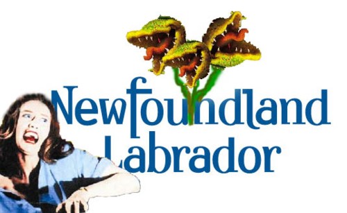
Over at RJ:Product, they are running a contest for alternative logo designs for Newfoundland and Labrador.

The submissions are pretty funny so far. One stands out though since it riffs on the fairly obvious Little Shop of Horrors theme.

Enjoy!

Chances of second refinery in NL more remote

Chances of a second refinery being built in Newfoundland and Labrador dropped again Wednesday with news that oil prices continued a downward turned and Irving is planning to double its refining capacity at Saint John with the construction of a new facility there.

Plans for refinery are expected to be unveiled Thursday in a presentation to the Saint John Board of Trade.

The second Saint John refinery will reportedly have the capacity to refine 300, 000 barrels per day. It will join the existing Irving refinery in the city that processes about 250,000 barrels per day. Irving is reportedly planning to upgrade at a cost of $1.0 billion.

The new refinery project is in addition to another Irving venture to build a $750 million liquid natural gas terminal in the New Brunswick port city. Having a reliable supply of natural gas is reportedly crucial to the development of the second refinery.

Word of the second refinery for Saint John made business news across the country.

Meanwhile in Newfoundland and Labrador, little is being said today of Danny Williams wordmark announcement yesterday. The exception is in the land o'bloggers and on the province's radio call-in shows where callers organized by the Premier's Office continue to battle ordinary citizens who complain about the $1.1 million plus price tag for the project thus far.

There was no mention of Williams' initiative - reputedly able to solve the province's economic woes - in any of the country's major newspapers.

On the business front in Newfoundland and Labrador, plans for a natural gas processing facility located in Placentia Bay remain little more than a rumour. Any development of natural gas offshore Newfoundland and Labrador remains contingent in part on technical developments and, especially on the province's natural gas royalty regime. The royalty structure is expected to be released by the provincial government in December after nearly a decade of study.

A consortium studying a second oil refinery near the site of the existing Come-by-Chance facility is proceeding to a detailed design and costing phase of its evaluation. A decision on whether or not to proceed with construction is expected before the end of 2006.

That decision will hinge on several factors but undoubtedly one will be competition from new construction or upgrades to existing facilities that are already feeding the lucrative New England market. Saint John is the closest Canadian refinery to New England. Refined product can be shipped to the United States by tanker from the Port of Saint John or by land.

Harvest Energy, new owners of the Come-by-Chance facility, have already signaled their intention to increase the refinery's capacity.

In other Newfoundland and Labrador energy news, the $10 billion dollar Hebron project remains dead despite efforts by Danny Williams and his senior officials to lure the companies back to the negotiating table. Talks aimed at developing the 500 million barrel field ended acrimoniously in April with Premier Danny Williams threatening to find a legal way to force the oil companies to develop the project on his terms.

Newfoundland and Labrador finance minister Loyola Sullivan also commented Wednesday on Fraser Institute report that indicated Newfoundland and Labrador may spend upwards of half its annual budget on health care by 2030 if current trends continue. Sullivan said health costs are rising at an uncontrollable rate and that something would need to be done. Sullivan offered no indication of what the provincial will do or why it has allowed health care spending to grow uncontrollable.

Under the Constitution, health care is entirely the responsibility of the provincial government, although some provinces. Since taking office in 2003, Premier Danny Williams has continued to demand increased transfer payments from Ottawa to provide core provincial responsibilities. This is despite the government's growing oil revenues and despite Williams having rejected a Hebron development deal that would have delivered to provincial coffers royalties and other revenues greater than the provincial accrual debt. Further development of other fields near Hebron would have greatly increased provincial revenues over the life of the project.

04 October 2006

Another rejected Danny wordmark concept

Intrepid dumpster divers braved rotting heaps of leftovers from the countless meetings it took to come up with Danny Williams' Great Brand to find one of the entries that came closest to being adopted.

Williams revealed a wordmark on Monday that, if he is to be believed, is the only thing needed to turn the province from despair to prosperity. Only thing that is except for keeping him as The Leader.

According to notes in the file, this concept was designed to appeal to Williams' townie nationalist sensibilities. The bold venture was rejected, if the cryptic notes scribbled in Latin in the margin are any guide, since it was felt that the Celtification of Newfoundland (and Newfoundland Labrador) should be gradual as part of a process of inventing history and tradition to replace what actually occurred and existed.

Note the prominent placement of Danny Williams' preferred flag of Newfoundland. (and Newfoundland Labrador).

You'll never know how close we came to becoming known as the Land of Fish.


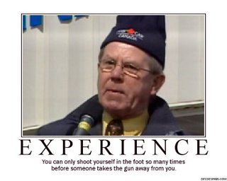
Demotivational Posters

From the geniuses at Despair Inc, comes a program to let you create your own Demotivation poster.
(h/t to towniebastard)

Rejected Danny Logo Concepts

A savy reader of the Bond Papers pointed out that what Danny Williams unveiled yesterday is actually a wordmark and not a logo.

Absolutely correct, but the distinction between brand and logo is the same as the one between brand and wordmark so the bulk of the previous post - Where's the beef? - still holds up.

Anyway, found in a local dumpster was this picture (left) of a design concept for the new Danny Branding Project that was rejected as being a bit too carnivorous.

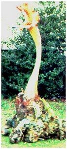
Also rejected as being inappropriate was the other famous carnivorous plant, the Triffid. Many of us recall that book from our grade-school English classes and I know that when I saw the stalky things in the new Danny wordmark, the first thing that came to my mind was: triffid (right).

Somewhere along the line, someone suggested that there might some value in acquiring the rights to adapt the song (below) from Little Shop of Horrors in which the carnivorous plant explains just exactly how the world is gonna work now that he's on Earth. Notes found with the rejected design concepts above suggest that while the client was generally satisfied Audrey II's sentiments were an accurate description of the New Approach, it was felt the name of the plant might lead to a bit too much ribald humour at Danny's expense.

Apparently it's one thing to do it privately but no one felt the government should implicitly declare it okay to poke fun at The Leader.

Well, that shouldn't stop the rest of us from imaginging what might have been:

Where's the beef?

At the outset, let's make it clear what Danny Williams announced yesterday and what he didn't.

He announced a new logo for the Government of Newfoundland and Labrador, to replace the shield from the coat of arms that has been used for the past 15 years.

A logo is nothing more than the visual identity. It's the sign or symbol that helps distinguish a particular product, company or organization from the multitude of other similar things out there competing for attention.

Danny announced a logo (right).

Logo versus brand

Nike's swoosh is a logo. It is the way potential athletic apparel consumers find a Nike product on a shelf or a rack. Nike advertising is designed to do a couple of things, one of which is train people to identify the logo.

Ford has had the same logo since the first Model A rolled off the assembly line. It's the word FORD in a blue oval.

No one - except the odd bobble head - buys a pair Nike running shoes or a Ford truck because they think the logo is cute.

They buy the product for other reasons, most of which is the relationship that has grown up between that consumer and the product.

They buy the product.

Based on a relationship.

Based on a reputation.

And that's what distinguishes brand from logo.

A brand is built on the cumulative thoughts, emotions and feelings individuals about a product, service, company or organization.

Companies spend considerable sums to develop and maintain the most positive relationships imaginable. Sure they advertise. But they also pay attention to things like the greeting you get when you call the company offices, the efficiency of the service you get and ultimately, the ability of the product or service being sold to deliver on its promises.

Look at it this way: VOCM is a powerful brand in the local media community. But the brand is built on delivering entertainment and news that consumers want. We know they want the VOCM product because regular measurement of audiences show how many ears are tuned to the VO frequencies. The brand reputation is built on the consistent record of community involvement. The logo is almost irrelevant.

If VOCM paid someone to spend eight hours a day dragging fingernails across a chalkboard, they would only get the most masochistic of listeners - a very small population at the best of times. The fact they have a magical logo would be irrelevant. For the majority of consumers, the product sucks even if the logo is pretty.

Product sucks; logo is cute; brand still sucks.

The Williams Logo

With that distinction understood, let's take a look at what this logo initiative is really all about.

Danny Williams' entire administration is built around the idea that everything changed in Newfoundland and Labrador when he became Premier. Very early in his administration he began looking for a new visual image to reflect that. The $98,000 baseline research contract for the logo initiative was awarded to Target in late 2004, with treasury board approving an exception for the contract from the normal public tendering process.

Over the next two years, Williams examined every existing visual symbol of the province. he did it in the context of the logo project but, as as been reported elsewhere, he also polled on attitudes toward the flag. Williams himself was reportedly surprised that the Peckford flag was more popular than his own personal choice, the Pink, White and Green.

The problem with all of those other symbols - from the Coat of Arms first granted in 1627 and adopted by the Dominion of Newfoundland three centuries later to the Peckford flag - is that they were introduced by someone other than Danny. Never mind that they are already well-established and popular with Newfoundlanders and Labradorians. They were someone else's symbols. They weren't Danny's.

What Williams settled on reflects Danny Williams. The pitcher plant is not used; that symbol is commonplace. Williams has approved the stems and flowers, a portion of the flower rarely seen in real life and even then, they are stylized not literal. The name of the province is also changed, rendered in both a Danny-blue colour and in a faux-Celtic font. Again the font and the celtification of the province's name reflects his own personal cultural references even if those references are limited to only a portion of the population.

The new logo is supposed to replace every other visual symbol, not just in government but across the province. In several interviews on Tuesday, the Premier mentioned wanting to seeing the logo on tourism materials, private-sector advertising and letterhead and even replacing the flag, pitcher plant and Newfoundland dogs on everything, one presumes, from lapel pins to tattoos.

In the same way Williams the typical politician is aiming at dominating the political landscape, he wants his logo to supplant every existing image.

The logo and the way it has been presented epitomizes Danny Williams and his political messages.

Where's the beef?

Ultimately, the weakness of the logo project is rooted in Williams himself.

All the qualities he tried to attribute to the new logo simply aren't present.

Leaving aside the insulting notion of likening the people of the province to vegetation, Williams has selected a plant which is actually not unique to Newfoundland and Labrador. It is found from Florida to Labrador and as far west as Iowa.

The pitcher plant is also an inappropriate symbol if someone wanted to portray a prosperous people who thrive based on ingenuity and creativity. The pitcher plant draws nourishment from the bogs in which it lives but it supplements its meagre root system by luring in unsuspecting insects and digesting the carcasses of the unfortunate flies and mites that drop into its water-filled cups. The pitcher plant is a predator, but it is a lazy one, dependent for its survival on the generosity of Providence, or more accurately, on the misfortune of those who fall into its grip.

Hardly an inviting, positive image, considering the negative reputation of the province across Canada as a place where people are forever dependent on federal handouts or among some Canadians who feel that we were rescued from poverty by Confederation.

Williams himself reinforced the inherently negative image of the pitcher plant - even as he tried to make it positive - when he told reporters that the plant "grows in a natural environment where no plant should ever grow". Newfoundland and Labrador is not a barren wasteland - "where no plant should grow" - but rather a place rich in resources and in genuinely resourceful people, people who take responsibility for themselves. People who are open, generous and inviting and who are prepared to work with anyone fairly for mutual benefit.

Aside from the limited cultural appeal of the logo within the province, Williams' new campaign to "sell" the logo to the people of the province is using an animated television spot that in itself is colourful and evocative. However, the music accompanying takes positive lyrics and demolishes whatever positive sentiment they contain in a mournful, gratingly high-pitched a cappella voice that while again Celtic in style takes on a banshee-like wailing quality when heard for the umpteenth time in the initial heavy media buy.

It's thin, plaintive sound is the opposite of strength and optimism, although it does fit very well with the negative image of the hard-done-by Newfoundland and Labrador victims Williams might contend he has been sent to save.

In the broadest sense, though, Williams logo initiative will fall well short of the claims that it will generate or at least support new tourism traffic and business investment. No logo does that. What undermines Williams new brand, as he would put it, is the brand Williams has already established for his administration and the province as a whole. As Bond Papers has noted before, the experience of investors dealing with Danny Williams is not good.

What will ultimately undermine Danny Williams' efforts to use a new "brand", to use his language, to fulfill his economic development miracle - again to use his stated goal - is the same core issue that Burger King once used to boost its own market share at the expense of its then-rival McDonald's. They'll look at his brand, not his logo. They'll look at Williams' reputation, not his image.

Prospective investors - like all consumers - will look at Williams' shiny logo and ask a simple question:

Where's the beef?

Danny's Plants

Elizabeth Driscoll: I keep seeing these people, all recognizing each other. Something is passing between them all, some secret. It's a conspiracy, I know it.

Matthew Bennel : There can't be a conspiracy!

Elizabeth Driscoll: Matthew, I'm telling you something is going on here.

"There's no emotion. None. Just the pretense of it. The words, the gesture, the tone of voice, everything else is the same, but not the feeling."


If nothing else, when Danny Williams today unveiled the provincial government's new logo (it isn't a brand for the province, people), he gave us the real name of those people he and his staff arrange to go on radio call-in shows singing hymns of praise to The Leader's gloriously miracle-delivering backside.

They were out in force this afternoon of course, and again this evening.

Yes, ladies and gentlemen, I give you:

The Pitcher Plants.

Just think about it:

- There is something slightly creepy about the whole planted caller thing, anyway, in an Invasion of the Body Snatchers kinda way. The way they all say exactly the same sorts of things in almost exactly the same way...almost as if they were being fed by the same invisible vines.

The way they seem to appear and disappear the same way Danny appears and disappears and they always show up in clusters to attack anyone who isn't of The Body.

No wait.

That was Landreu and Star Trek.

But ya know what I mean..

- More than a few people have noted the things sticking up out of the new logo look supernatural or science fiction- ish.

- For some bizarre reason, Danny thinks those stalky things rising up from the Danny-redefined "Newfoundland" somehow embody the people of Newfoundland and Labrador. See? "body"..."embody". Huh? Huh?

- Danny has already said, our job, as Newfoundlanders and Labradorians is to fall in line behind him and back him up on whatever he says. That reduces us to the status of vegetation.

By, if ya think about it, it all starts to make sense. We are all just Danny's Plants.

After all, how else can you explain spending a million dollars on something as uncreative as the new "brand"?

_____________________________

Addendum: The price of the project was actually more like $1.1 million, at least. Danny neglected to mention - for some reason - the "branding" contract handed to Target in late 2004 to do opinion research on images of the province.

Without going to tender.

Wonder what other work he forgot to tell us about?