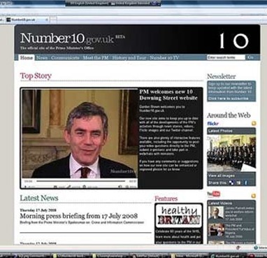
Via Neville Hobson, comes a link to Simon Dickson's post on the new look coming soon to the website of the Prime Minister's office in the United Kingdom.
 number10.gov.uk will go from look like many other sites out there to looking like this, right. There are slightly better quality photos available from the Downing Street Flickr space.
Yes, the Prime Minister's Office uses Flickr. They use Twitter and the whole gamut of social media.
As you can see from Simon's description the site looks like a blog because they are using WordPress as the platform. There's a rationale Simon offers, but frankly, anyone using the site will find that the blog approach to layout simply works more efficiently than most other designs when it comes to making the information readily accessible.
The current Number 10 site is good but it has a tendency to be an assault on the eyeballs. The new version goes for images - like the official stills at Flickr - and in Number 10 TV which is the new centrepiece. Simon notes that the new video component will not be youtube, although, here again Number 10 has been using the groundbreaking video site for a little over a year.
On the right of the new layout are two columns of information, mostly conveyed in images, which take you off to other places if you are so inclined.
Compare this, for argument's sake, with any provincial government website. That's the main government site and from there you can get to all sorts of places. The thing is depressingly out of date in both layout and content and there seems to be no move afoot to change things. Aside: it would be nice to be proven wrong on these things, you know.
Other provincial government sites across the country are not significantly better, although as time passes, the gov.nl site is looking increasingly tired. Try to find information on the community recreation develop program for example.
After a considerable trek through the maze of clicks, you wind up at a page with a single paragraph on it:
Designed to offset the cost of providing recreation and sport/active living programs and leisure services with the Community Recreation Committees in communities of less than 6000 people can apply for financial support. Application forms are available through regional offices.
There's no indication of how long the program's been around, who has gotten it in the past or any of the other sorts of information you might expect to find here either to help demonstrate accountability or to give a clue as to what sorts of projects get the cash.
But here's a poser for you: which regional office are they talking about? You see having a pdf here would be marvelously simple. Better still they could have a form available to submit online. But they want me to go to a regional office.
Okay.
The recreation division of the department of which recreation is a tiny bit doesn't have regional offices. Well, at least that's how it appears. Maybe they meant the tourism regional offices. Doesn't make much sense but maybe that's what they meant.
Try to find clear information on the website as to where those offices are.
Try the Sport Newfoundland and Labrador link on the department services and programs directory. A logical choice but the link is dead. It should be sportnl.ca, not sportnf.ca but nobody bothered to change the link. (Another poser for you: How long ago did the province's name change?) You'll find a form there for capital grants but there's no way of knowing - from the website - if this is the same as the development grant where you started your search.
See the point?
The issue here is not one of look. It's really about providing information to people in a form and in a way which is most convenient for them. Having election statistical reports available for view in the Legislative Library is nice but it the model of accountability left from an age when a quill pen was the height of modern technology.
Accountability is not accomplished by having agencies issue plans which state that the officials responsible for sweeping the floors have established as their strategic goal to sweep floors and that they plan to do it by acquiring brooms and then applying them daily according to the standard broom employment manual recently issued for the amalgamated office of the chief sweeping officer.
Transparency doesn't come from issuing a report in which the minister responsible for the CSO indicates his extreme pleasure at issuing a report on the strategic sweeping operations, which, incidentally, recounts in entirely uninformative detail the fact that brooms were employed sometimes in one direction and sometimes in another in order to achieve the miracle of clean floors which have been brought to government buildings through the existence of the OCSO.
Openness is an attitude.
The attitude needs a behaviour to make it work.
The behaviour is simply providing information.
To see how dramatic and functional the changes can be, consider the rapid transformation of the offshore board website. To most people this site is not at the top of their bookmarks. But, for the people interested in the offshore, they can now access relevant information in a much easier way than before. They can do it when it suits their schedule.
The revamp of Number 10's website is a behaviour that tells you the attitude is there to be open and push information into the public domain. We can argue another time whether what they release is useful or relevant.
It's one more people and more offices should emulate.
-srbp-