There is a difference between political communications and advertising.
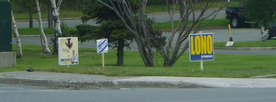
Here’s a simple, graphic example.

It uses bright colours and a font that is easy to read, even at a distance.
It was not designed by an ad agency.
A by-product of the design is that it is also visible – and legible – when travelling at the speeds one normally encounters in city driving.
The other two weren’t.
Obviously.
The pictures were taken at the intersection of Westerland Road and the parkway, from the corner opposite the signs and without any zoom.

-srbp-